In case you missed it, the KHS Westerly Shelter Harbor New House and Garage is now posted to the KHS portfolio on the website.
by Katie Hutchison for House Enthusiast

Your Custom Text Here
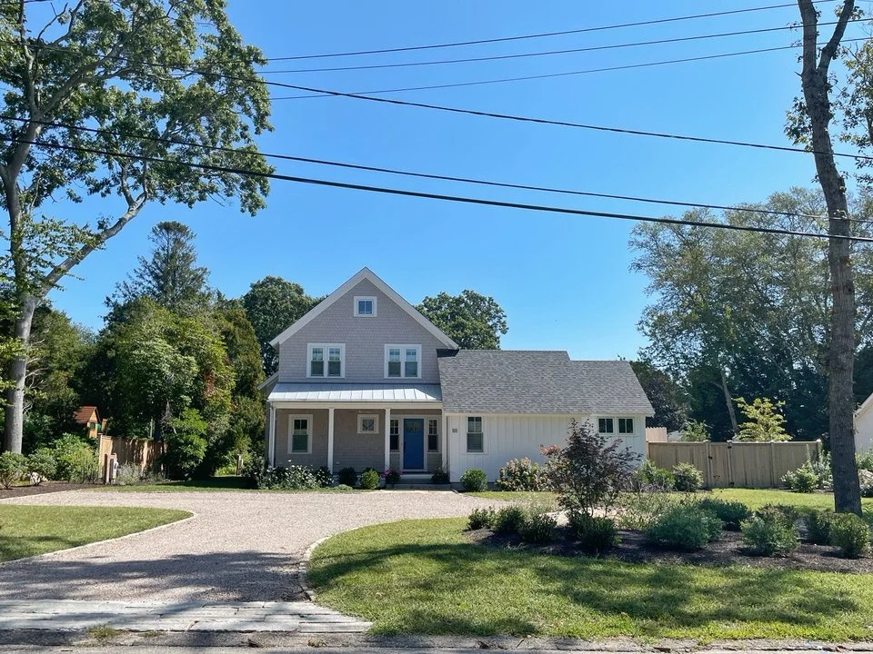
In case you missed it, the KHS Westerly Shelter Harbor New House and Garage is now posted to the KHS portfolio on the website.
by Katie Hutchison for House Enthusiast
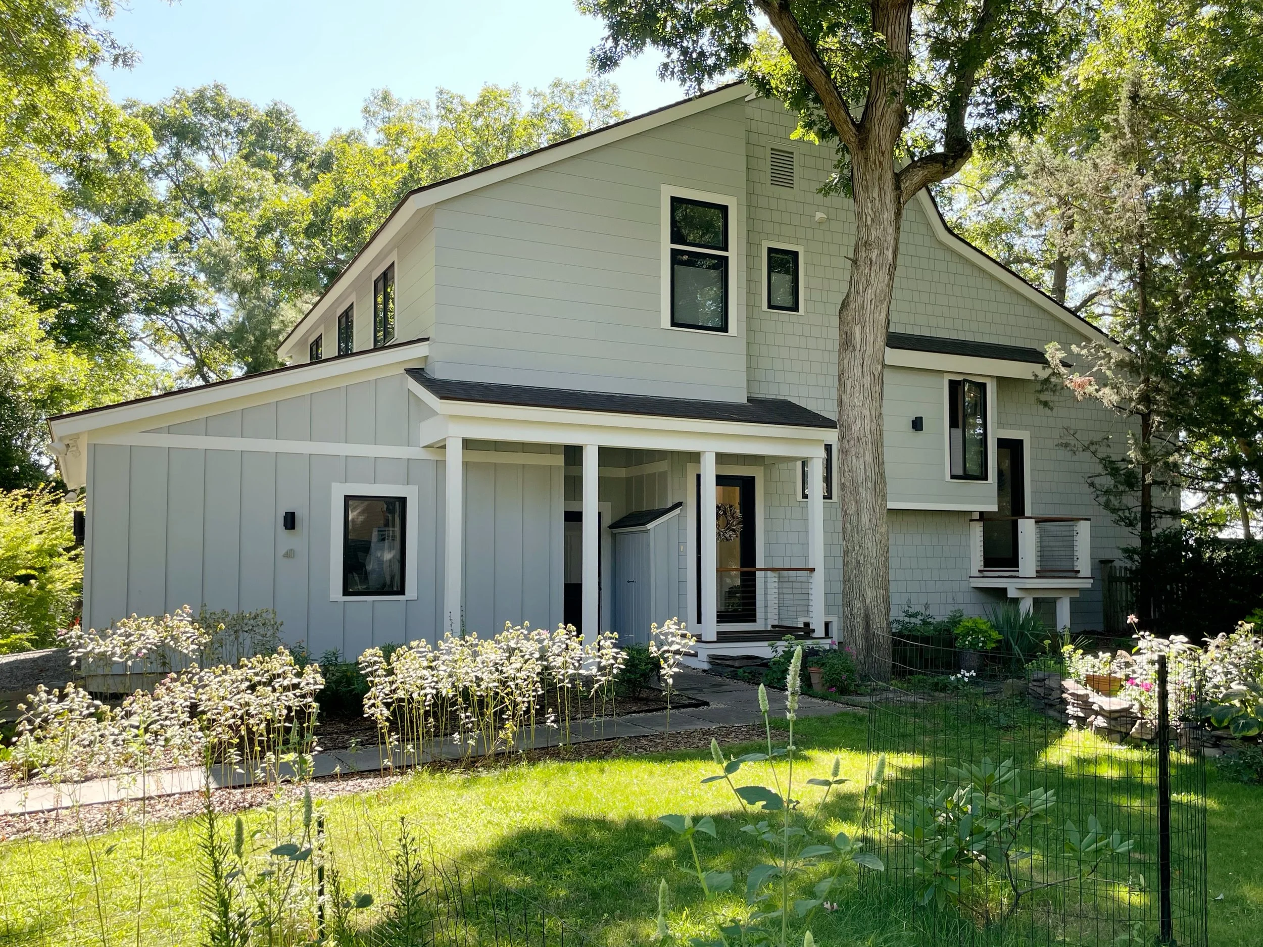
I recently had a chance to capture the KHS Barrington Contemporary Renovation/Addition in its summer glory and to update its KHS webpage. Also note that the KHS Barrington Modern Bathrooms, which are inside this project, were completed in an earlier phase.
by Katie Hutchison for House Enthusiast

Katie with project builder Chris Manlove of Swanson Construction Company, Inc.
This spring the KHS Touisset Garage/Backyard Cottage was awarded Third Place Residential New Construction/Renovation.
There were some great photo ops at the awards ceremony held at Something Fishy, Inc. in Warwick.
That’s Katie, in the first image of the slideshow, with Rhode Island Monthly’s Dana Laverty. Rhode Island Monthly’s publisher John J. Palumbo opened the event. And the third image in the slideshow is of Katie and builder Chris.
It was an honor to be celebrate among the other award recipients.
by Katie Hutchison for House Enthusiast
Click on the image to get the video to play.
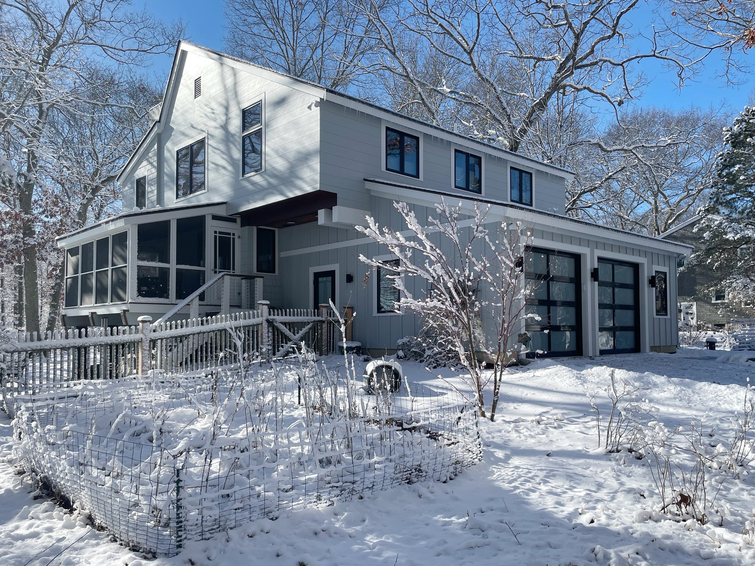
Find this recently completed project in the Renovation/Addition section of the KHS website. Also note that the Barrington Modern Bathrooms, which are inside this project, were completed in an earlier phase.
by Katie Hutchison for House Enthusiast