
Fort Point Open Studios

fptopen.jpgOn a gorgeous Sunday afternoon, I had the pleasure of attending this diverse arts event housed in the adapted, historic, masonry warehouses of Boston’s Fort Point arts district. I’d never been before and was delighted by the chance to browse through all manner of artwork in some exquisite loft studios. Many were drenched with light, bordered by old brick, and topped with exposed rough-hewn wood beams, making the event as much a self-guided architectural tour as an arts happening.

My time was limited, so I only touched on a few of the many offerings, but several caught my eye. I decided with my fellow tour companions to explore a large venue first, 249 A Street. There we found book artist Laura Davidson in a sunny spot with an eclectic display of her one-of-a-kind and limited edition books. Her Fenway Park “tunnel book” was a highlight. It’s a small, hand-assembled presentation of layered, pictorial pages that create a nostalgic, diorama-like view of the stadium and Boston skyline. (Her timing couldn't be better.) Paper mosaics titled the “Antiquities Series” likewise reveal her careful craftsmanship and taste for the muted tones we associate with the patina of age. Her work deftly manipulates paper to great three-dimensional effect.

In the same building, we also discovered photographer Don Eyles whose

Read more

Design snapshot: Harvest-inspired palette

Click on this photo to see it in the note cards/prints gallery.Maybe I’m being influenced by the season, but I find this pumpkin-orange-colored antique with white window sashes and curtains as tempting as candy corn. Yes, I have a sweet tooth. Interestingly, this type of strong color was often featured on original colonial houses, rather than the faded colors we tend to associate with our forefathers’ homes. Painting the clapboards the same color as the thick window trim and sill makes a bold statement. The contrasting white window sashes provide a bright accent. Playful shadows cast on the interior curtains by the window muntins round out a pleasingly graphic composition.

by Katie Hutchison for the House Enthusiast

Design snapshot: Entry porch personality

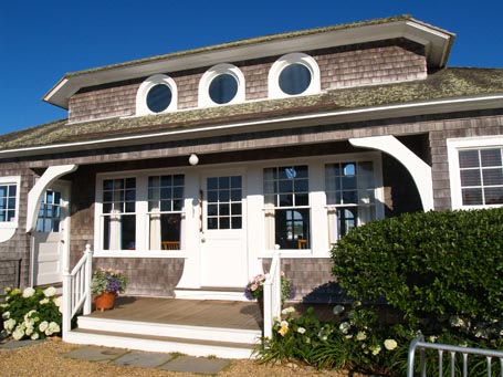
dssentryporch.jpgI’ve been photographing this seaside gem for years. There’s so much that’s right about it. The width of the porch is gracious and welcoming. The overhang is just deep enough to keep the rain off, but not too deep to become dark and encumbered. Even though it provides access to doors in two different directions, there’s no confusion about which is the front door and which is the side door. The double-hung windows that flank the main entry entice visitors with a glimpse through the building to the view beyond. Curved brackets and flared door trim echo the boat-like detailing of the porthole dormer windows above. It’s an appealing example of what well-considered design can achieve.

by Katie Hutchison for the House Enthusiast

Primer: Third dimension

primer3dlead.jpgLearn to modulate this potent design factor

You would think it would be obvious, but sometimes it needs to be said: attention to the third dimension is critical to shaping space. All too often in a rush to plan room-to-room adjacencies and sequencing on a particular floor level, treatment of the third dimension becomes an afterthought. The common default of endless flat ceilings is a missed opportunity. So is circulation between full-height walls in lieu of passage through capped doorways. Even worse, the third dimension is frequently manipulated in a misguided attempt to meet so called “market demand”. Real estate listings boast double-height entries and “great rooms” as assets when often such spaces are poorly designed and prove overwhelming and discomforting. They needn’t be. Spatial variety in the form of interludes with lower ceilings in which to pause or take personal shelter can relieve otherwise tall, open spaces.

The tendency to think in two dimensions, rather than three, means many are only addressing two-thirds of our spatial experience. We can do better. In this primer we’re going to look at everyday outdoor examples in which the third dimension is tempered to create different effects which support different activities, expectations, and moods. I’ll translate those examples to simple diagrams to apply to our indoor environments. With a little thought and common sense, we can begin to harness the rewards of varying the third dimension in our homes.

Read more

Design snapshot: Frame it to fathom it

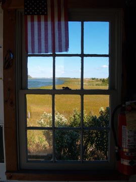
Click on this photo to see it in the note cards/prints gallery.Last weekend I scanned the vast panorama that surrounded me as I approached the beach; then I peeked into a nearby shed and marveled at this window that captured the setting concisely. I stopped and drank in the multiple framed views composed by the individual window panes. I had just been looking at the same beach grass and body of water seconds before I spotted the shed window, but it hadn’t riveted my attention until I saw it from within the shed, through the frame of the window. What had appeared boundless and somewhat unfathomable when outside was parsed into distinct intelligible moments inside, thanks to the modest double-hung window with six lites over six lites. Surprisingly, this type of parsed view can be far more rewarding than a gaping one.

by Katie Hutchison for the House Enthusiast