Design Life Now: National Design Triennial at the ICA

icadesignnow.jpg
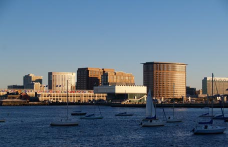
I have mixed feelings about the Institute of Contemporary Art in Boston. You may have seen all the press that it received when the new building, designed by Diller Scofidio + Renfro, opened last winter. Most photos of it are from the water, like the one above, where the cantilevered upper floors and canted sculptural media center are shown to their best advantage. Unfortunately it has a dreadful, blank, street presence; it’s pushed far back from the road, beyond a seemingly endless asphalt parking lot.

Shortly after it opened, I visited the museum with some fellow architects. As we toured the various exhibit spaces, we enjoyed bandying about stream-of-conscious criticism. We stopped sniping though when we stepped into the digital media center. It’s the space with computer stations serving stadium-style seating that projects below the cantilever and culminates in an enormous glass window, canted downward to frame a spectacular view of the water, not the shoreline. It was exhilarating. Later, in search of the restrooms we stumbled upon the Founders Gallery at the north end of the fourth floor exhibit space that runs the width of the building with a glass wall in the long dimension parallel to the water view. There you can stand above the water and take in the stunning panorama, as if the museum is merely setting the stage for the real show, the art of the contemporary cityscape.

But I digress. I went to the ICA most recently to tour their Design Life Now exhibit which was organized by the Cooper Hewitt, National Design Museum and runs through January 6, 2008. Upon entering the exhibit, wall graphics proclaim, “This survey of design in the U.S. presents the best work from 2003-2006.” Really?

Read more

Design snapshot: Sach's covered bridge

dssbridgeext.jpgLast weekend I strayed from New England and visited this covered bridge in Gettysburg, Pennsylvania. Built in 1852 to span approximately 100 feet across Marsh Creek, it later served both Union and Confederate soldiers in the Battle of Gettysburg. It was closed to traffic in the late 1960’s, and in 1996 floodwaters swept it from its abutments. After raising it three feet and reinforcing it with steel beams, it was then reopened to foot traffic.

The simplicity of its exterior purposeful form has both nostalgic and contemporary appeal. Bands of clapboard cladding alternating with unclad bands, in which crossing structural members are exposed, emphasize the length and tectonics of the span with elegance. From the interior, the diagonal geometry of the substantial exposed wall framing and overhead trusses repeats as if in rhythm with your pace as your cross from one side to the other.

1185797-1122755-thumbnail.jpgCuriously, the lower, continuous unclad band that invites air and intermittent daylight inside is below eye level. This directs your focus inward and reinforces the sheltering experience. I wonder, though, if the restoration change to the bridge elevation put the daylight openings below eye level; perhaps the soldiers in 1863 could have looked out with greater ease because they were crossing on a different, lower floor level relative to the daylight openings. On the other hand, it may have been intentionally originally designed to limit view and exposure. Still, I longed to pause en route and comfortably take in the view from within. Too bad for me. I’ll have to design my own covered bridge.

by Katie Hutchison for the House Enthusiast

Design snapshot: Interior inspiration

dsseyebrowdormer.jpgWhen I came across this scene, I felt as if I’d walked into a Vilhelm Hammershoi painting. If you’re not familiar with Hammershoi, he’s the Danish painter from the turn of the century who captured quiet interiors and exteriors with soft, luminous light. This aging, eyebrow dormer window -- complete with peeling paint, rows of snail shells, and view of a peaceful meadow -- gave me butterflies.

The confluence of elements that had me all aflutter are really rather fundamental. The curved ceiling, under which the eyebrow window nestles, is comfortably embracing. The center, operable, six-lite casements invite fresh air, daylight, and communion with the meadow below. The fixed, multi-pane sashes on either end of the curve extend the view frame and emphasize an intimate scale, requiring you to approach with head bent if you desire a closer look outdoors. The crackling, creamy white finishes with glimpses of green paint below reflect the room’s history and the vagaries of personal taste. The collection of shells carefully arranged on the sill reminds us that the sea is nearby and that someone has enjoyed collecting its offerings to display in this special, private spot.

After I saw this tableau, I was ready to move in to this little house. If only.

by Katie Hutchison for the House Enthusiast

Fort Point Open Studios

fptopen.jpgOn a gorgeous Sunday afternoon, I had the pleasure of attending this diverse arts event housed in the adapted, historic, masonry warehouses of Boston’s Fort Point arts district. I’d never been before and was delighted by the chance to browse through all manner of artwork in some exquisite loft studios. Many were drenched with light, bordered by old brick, and topped with exposed rough-hewn wood beams, making the event as much a self-guided architectural tour as an arts happening.

My time was limited, so I only touched on a few of the many offerings, but several caught my eye. I decided with my fellow tour companions to explore a large venue first, 249 A Street. There we found book artist Laura Davidson in a sunny spot with an eclectic display of her one-of-a-kind and limited edition books. Her Fenway Park “tunnel book” was a highlight. It’s a small, hand-assembled presentation of layered, pictorial pages that create a nostalgic, diorama-like view of the stadium and Boston skyline. (Her timing couldn't be better.) Paper mosaics titled the “Antiquities Series” likewise reveal her careful craftsmanship and taste for the muted tones we associate with the patina of age. Her work deftly manipulates paper to great three-dimensional effect.

In the same building, we also discovered photographer Don Eyles whose

Read more

Design snapshot: Harvest-inspired palette

Click on this photo to see it in the note cards/prints gallery.Maybe I’m being influenced by the season, but I find this pumpkin-orange-colored antique with white window sashes and curtains as tempting as candy corn. Yes, I have a sweet tooth. Interestingly, this type of strong color was often featured on original colonial houses, rather than the faded colors we tend to associate with our forefathers’ homes. Painting the clapboards the same color as the thick window trim and sill makes a bold statement. The contrasting white window sashes provide a bright accent. Playful shadows cast on the interior curtains by the window muntins round out a pleasingly graphic composition.

by Katie Hutchison for the House Enthusiast