Home is where the neighborhood is

ArchitectureBoston just published an issue about neighborhood, which got me thinking. Sure it’s the twenty-first century, but our neighborhood is in an eighteenth century Salem condominium building. It’s a four-unit Georgian that was once an approximately 4,600 square-foot single-family home for a successful sea captain. Since the house is symmetrical with a center stair hall, it divided rather neatly into separate, eminently livable units in the ‘80s. My husband and I occupy one of the upper quadrants on the second and third floors. We share horse-hair plaster walls, wide-pine floors, twisting balusters and pride of place with our neighbors in the building.

Together we plan the building’s future, and, in the process, intertwine our destinies. We’ve orchestrated innumerable maintenance projects to repair or replace: the foundation sills, the siding, the trim, the roof, and the chimney, to name a few. At times, project planning and funding have become contentious as individual budgets tighten due to life events and fluctuating economies. Yet, over seven years of ad hoc condominium meetings, we’ve all managed to make accommodations for the better of the building, the group, and, thus, ourselves. We informally take turns bringing trash to the curb, cleaning the entry hall, tending to the garden, and looking after each other’s house plants or cats. We’ve even started sharing dinner get-togethers in which condominium business isn’t on the agenda. We’ve forged our own neighborhood of four households.

It’s a worthy model for how to create twenty-first century neighborhoods in general. Before considering other important building-to-building, building-to-open-space, or building-use to building-use relationships, we should focus on inter-building unit-to-unit relationships. Rehabbing, recycling, and re-apportioning space within existing housing stock is a green way to create affordable housing opportunities in which small groups of homeowners can benefit from old-house charm and individuality while shaping their own internal neighborhoods.

Even if older stock isn’t available for condominium conversion, new condominium buildings of well-crafted design, containing four unique units or less, can provide an affordable and desirable entrée to the housing market, while allowing each unit owner a meaningful ownership stake in the greater condominium.

Living in a somewhat quirky, four-unit condominium building is more like collaborating on the management of a large, single-family home than participating in the more unwieldy bureaucracy of a condo association comprised of ten or more cookie-cutter units. It’s high-density living that accommodates our natural affinity for shaping individualized space within a community.

Our condominium is but one internal neighborhood building block within our outer neighborhood of tightly sited, moderately-scaled, antique structures of mixed uses, ranging from other old-house condominiums to a homemade-ice-cream shop, a house museum, a tattoo parlor, and a National Park Service destination. All this is walking distance from the train station, Post Office, pocket parks, and waterfront. It’s a glorious, vibrant hodge-podge that works on the more macro level in part because it works first on the more micro level within buildings like ours.

by Katie Hutchison for House Enthusiast

Design Snapshot: Tobacco barn revisited

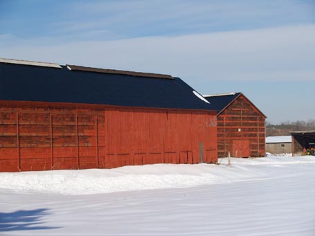
Here are some more Connecticut tobacco barns. You may remember, from my previous post, that such barns were constructed to store and dry cigar leaf tobacco. This one uniquely combines both horizontal and vertical, hinged, ventilating boards. The black, corrugated metal gable roof and weathered red planking, against the snowy landscape, form a New England hallmark.


The design of the Community Rowing, Inc. Harry Parker Boathouse in Brighton by Anmahian Winton Architects took its inspiration from these types of barns. The Boathouse’s exterior planking is mechanized to open in order to dry rowing shells within. It’s a beautiful idea. A similar concept could be adapted to part of a residential breezeway or porch in which planking is manually opened for light and ventilation, but closed during inclement weather. Reinterpreting vernacular work buildings for different uses today creatively roots our present in our past. The result can be a uniquely evolved New England typology.


by Katie Hutchison for the House Enthusiast

Demise of shelter magazines

The regrettable loss of design democratizers

Since trouble in the housing market initiated our current economic slide, it’s no surprise that shelter magazines are among the latest casualties of the recession. House & Garden started the dismal parade when it folded in November 2007. Since then In Style Home, Blueprint, Home, Cottage Living, O at Home, Country Home, and Domino have closed their doors.

Historically, mainstream shelter magazines served a market hungry for design advice, but which often lacked the resources to retain architects. That’s a large readership when you consider that at least 95% of new homes in the U.S. don’t involve architects. The colorful, photo-rich pages of many shelter magazines were great design democratizers, offering tips and inspiration to do-it-yourselfers and those working directly with builders and designers (or even architects). Over time, T.V. and the internet stepped in to meet growing demand, providing different but often complementary material. Despite what eventually may have become an oversaturated category, it seems it was lack of advertising dollars, not lack of readership, which ultimately starved so many publications.

House & Garden had a readership of nearly one million at the end. Home reached a circulation of more than 800,000 in its final year. Cottage Living had a circulation in excess of one million. Country Home had over one-and-one quarter million last summer. Domino is estimated to have had 850,000. You get the picture. In a recent Washington Post article Deborah Burns, a senior V.P. at the Luxury Design Group (which includes Metropolitan Home and Elle Décor, two affluent brands) explains, “There’s no advertising to support the lower and middle markets in the shelter category, so revenue falls.” What a shame; those are the very markets with the most use for shelter magazines.

a lament for Cottage Living

It’s Cottage Living I will really miss. It was lively and accessible, promoting thoughtful placemaking and informal living in authentic, right-sized homes. Founding Executive Editor Lindsay Bierman was quoted on the Time Inc. website when he was made Editor in Chief (one month before Time Inc. announced the magazine's closing) saying, “Cottage Living is leading the way toward an new American Dream, a lifestyle defined by appreciation of quality over quantity, a pride of place, and living large while leaving a small footprint.” And so it was.

In September 2006, I had the good fortune to write for Cottage Living about one of the projects I designed, the Manchester Garage/Garden Room. I was impressed with how professional and thorough their staff and freelancers were. We had a ball at the photo shoot. I was honored to be part of their publication. Apparently, Cottageiving.com will also be closing, so I don’t know how long the link to my article there will work. Time Inc. will reportedly “keep the Cottage Living brand alive in one of its other leading shelter titles…” I’ll be interested to see how.

what next?

Where will all of the bereft readers of the now defunct shelter magazines go? Perhaps they’ll start frequenting design blogs. Stephen Drucker, editor of House Beautiful, says in the Washington Post “I think blogs are the best thing to happen in my 30 years in the industry…They spread the word about us. Blogs are basically magazines that are not financially viable.” Ouch. He continues, “Magazines that are currently in peril would probably be much better off as blogs.”

It’s time for a different online alternative to the failed or failing shelter magazines. It’s time for something more akin to the editorial structure of Design Observer and which builds on their economic model, but focuses on home design for a general audience. Or something with the posting frequency and approachability of Garden Rant, but for house enthusiasts. Hmmm. There’s an idea. Maybe House Enthusiast could become that alternative. Like Design Observer and Garden Rant, which are each produced by several contributing experts in their respective fields, House Enthusiast could evolve to include additional expert collaborators. I don’t know how much revenue Design Observer generates directly from their website, but they include rotating, unobtrusive, targeted advertising from the Ads Via The Deck network. House Enthusiast could likewise incorporate content-appropriate, judicious advertising. Maybe House Enthusiast could also secure additional revenue by offering subscriptions for select content, conducting educational seminars, providing limited services, or conceiving of other innovative income streams. Maybe this more robust and collaborative House Enthusiast 2.0 could better serve readers set adrift by Cottage Living and the like.

why not?

So with this post I’m making an open call for astute writers and thinkers to join me in promoting regional, vernacular-inspired architecture and design for today’s living. I welcome your financially viable ideas. Email Katie@katiehutchison.com.

by Katie Hutchison for the House Enthusiast

Design snapshot: Shingle wall and trim

Click on this photo to see it in the note cards/prints gallery.The white-cedar-shingle wall cladding and trim, shown here, are New England mainstays. Thanks to careful planning, the shingle courses, which probably have approximately 5-inch exposure, align with the top of the window-head trim and the top of the window sill. The rake trim, which follows the roof slope on the gable end wall, is “clipped,” meaning the overhang is minimal. This is a common regional detail, harking back to early Capes. Here, the rake is made of a likely, nominal 8-inch board, with an overlapping crown molding, which adds tight shadow lines. The bead-board shutter is another Yankee touch. Together, these classic New England elements define a spare, but functional, and visually pleasing exterior treatment.

Read more about rake trim here, here, and here.

by Katie Hutchison for the House Enthusiast

Design snapshot: Connected-building vernacular

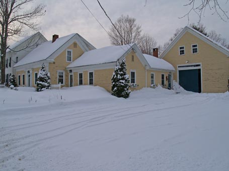
This in-town collection of connected buildings in Maine brings to mind the connected farm buildings Thomas Hubka wrote about in Big House, Little House, Back House, Barn. If you’re not familiar with his book, it’s definitely worth reading in order to better appreciate how this typology was adopted by New England farmers and why.

Here the “big house” is a modest 1 ½ story Greek Revival with a secondary “little house” set back, yet parallel to it. The “back house” forms an ell, connecting the front living spaces with the barn. It’s possible that the front Greek Revival originally stood separate from the barn and that the other wings were added over time, as the owners required more living and working space. Often the “little house” was constructed to contain the kitchen, freeing up a room in the “big house” for another use. The “back house” was generally a transitional work space, containing a shop, wash room, wood shed, or storage space – like a working mud room.


Today, assembling a collection of building elements, as in this vernacular example, can make sense when designing new homes too. Such assemblages allow multiple exposures to natural light which can travel deep within each component. They distribute the building’s volume, so it doesn’t appear overly large or monolithic, and they communicate a hierarchy of space and purpose. Connected buildings can also shape a dynamic outdoor space.

by Katie Hutchison for the House Enthusiast