
If you've been following the "Before & After" blog posts for this project, you might be interested in seeing the completed project in its entirety now posted to the KHS website portfolio pages. Find it here.
by Katie Hutchison for House Enthusiast

Your Custom Text Here

If you've been following the "Before & After" blog posts for this project, you might be interested in seeing the completed project in its entirety now posted to the KHS website portfolio pages. Find it here.
by Katie Hutchison for House Enthusiast
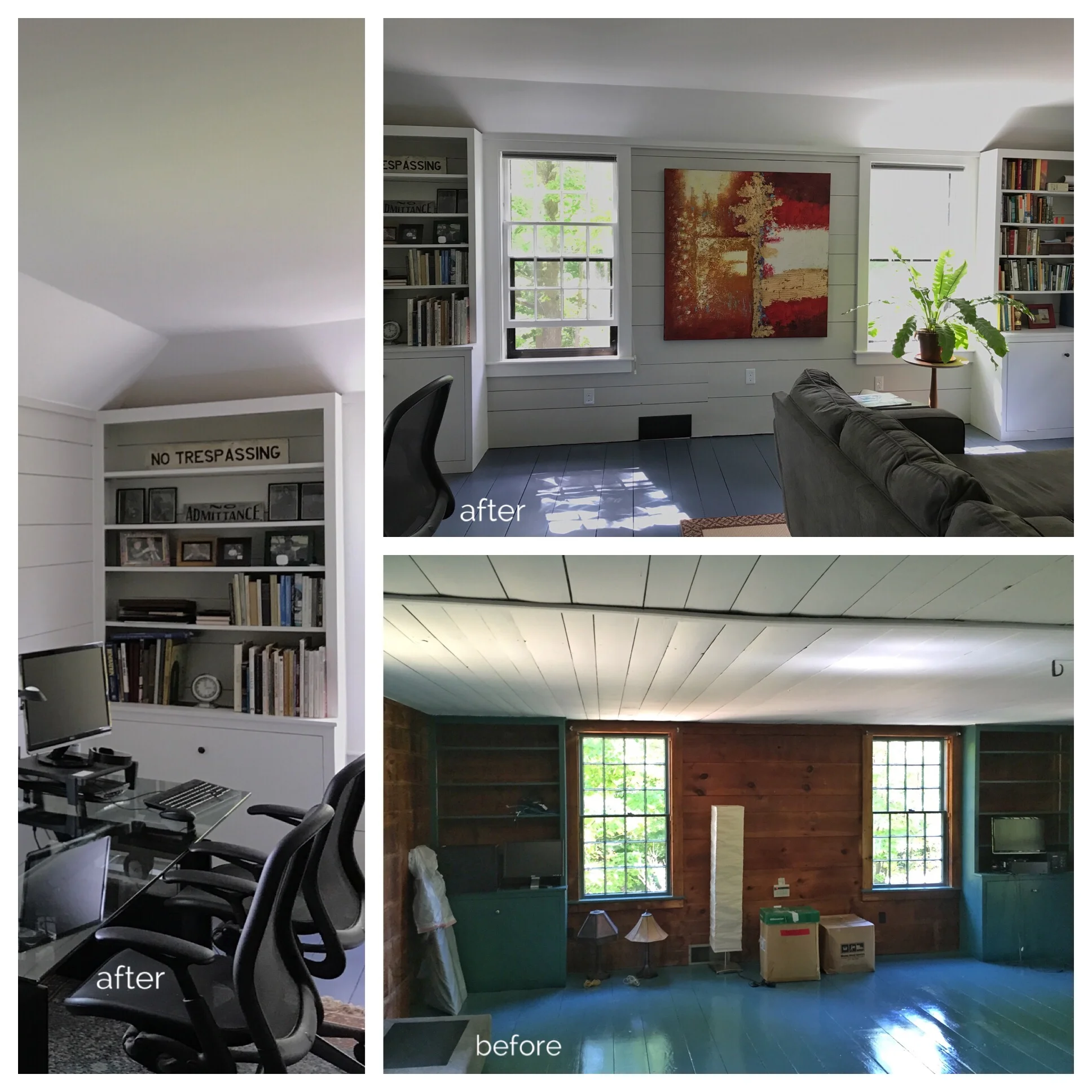
Upstairs, a very low and uneven board ceiling in the room that the owners use as a den/office made what is actually a very large room feel quite compressed. Dark, stained, board walls contributed a somewhat oppressive vibe. Replacing the board ceiling with a raised, plaster, tray ceiling that springs from above the original board walls -- painted a light color (Grout) from C2 Paint -- created a much more inviting, bright, and expansive space. New trim color (Sheer), also from C2 Paint, and a new floor color (C2's Magnet) tie the color palette in this room to the new palette in the rest of the house.
Look for more photos of this completed project on the KHS website portfolio soon.
by Katie Hutchison for House Enthusiast
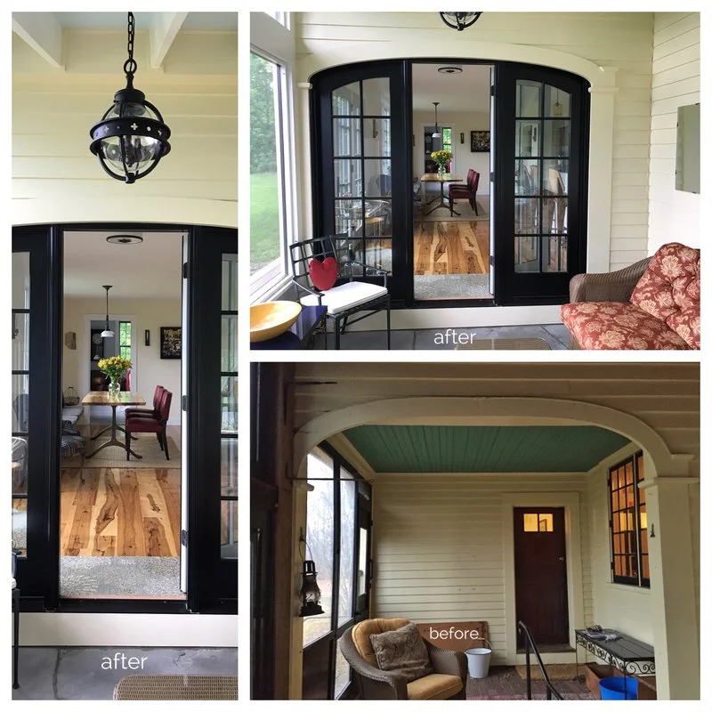
This "Before & After" pairing illustrates the fundamental change we made that enabled most of the other improvements in this renovation/addition project. The existing arched opening in the "Before" image (at bottom) separated a lower-level screened porch from an upper-level screened porch. The patio doors in the "After" photo (at top) now infill the arched opening. We removed the wall with the door and the perpendicular wall with the window seen in the "Before" image. These changes allowed us to capture the space beyond the arched opening for the interior to create an expanded semi-open dining/kitchen area. To make the interior expansion seamless, we raised the floor of the area that had been the upper-level porch, so it aligns with the main living level, and made sure there would be no soffits in the planes of the walls we removed. We also raised the floor of the lower-level porch to reduce the number of steps required to circulate from the newly expanded interior to the remaining screen porch. Stay tuned for more to come.
by Katie Hutchison for House Enthusiast
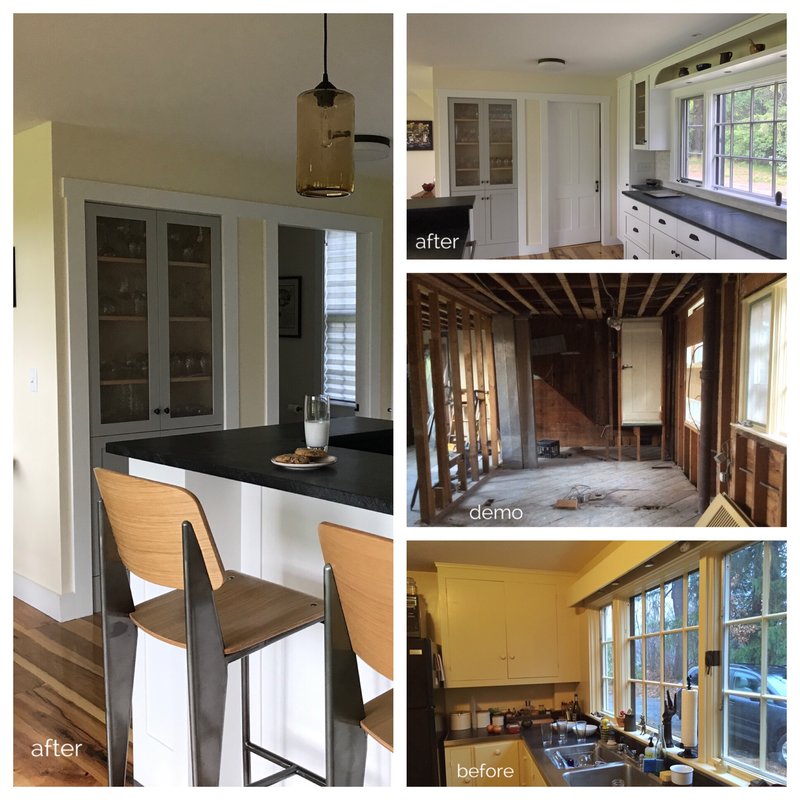
This is more of a "Before, Demo & After". To orient you, the window on the right in the three horizontal images above is the same window in every shot. The door seen in the middle "demo" image used to lead from the stair landing back down into a full bath. We reconfigured that bathroom to be accessed instead from the new door you see in the "after" image at the top. We removed the stud wall that you can see to the left in the "demo" image to create a more open kitchen/dining area which made room for the island with a breakfast bar top and bar seating that you see in the vertical image to the left. New soapstone counters and Shaker-style cabinets in addition to a new color palette help refresh the look. More to come.
by Katie Hutchison for House Enthusiast

To create a more open and expansive dining and kitchen area that's better connected to the rear yard, we removed the walls shown to the left and straight ahead in the "Before" photo (bottom). New patio doors, straight ahead and to the right in the "After" photo, fill the arched openings that had led from the former upper-level screen porch to the lower-level screen porch and the exterior (respectively). Daylight from four formerly failing casement windows, to the right in the "Before" photo, is now captured through three new casement windows in the same overall opening, to the right in the "After" photo. A custom built-in banquette, and custom table (from Ares Iron) comfortably allow for more diners than the small table in the "Before" photo. Reclaimed chestnut flooring and a new color palette round out the improvements. More "Before & After" photo pairings to come.
by Katie Hutchison for House Enthusiast