

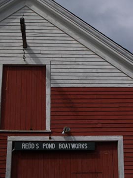
 This little boat shed captures the appeal of the New England vernacular. Its seeming simplicity is largely the result of good design. Like an Olympic athlete who’s mastered her sport, making it look almost effortless and easy, Redd’s Pond Boatworks makes a hard-working elevation look simple.
The composition of the two openings within the gable-end elevation sets the stage for contrast: triangle vs. rectangle, small vs. large, centered vs. offset, top vs. base. The proximity of the smaller, upper door opening to the larger door opening below links one to the other visually, with only a single red clapboard between their trim. The location of the larger door off to one side is balanced by the smaller, upper door centered within the gable.
It’s the use of color, though, that may seem the most striking. The white-on-white of the upper clapboards and trim calls attention to their dimension, depth, and texture. The red doors and lower red clapboards dramatically offset the white, while accenting the transition from the upper-middle part of the elevation to the top.
The construction of the different components further plays on contrast for their appeal. The vertical square-edge boards of both doors, bound by trim, graphically juxtapose the horizontal clapboards that surround them. The angle of the overhanging rake trim (along the roof) adds another dynamic set of graphic shadow lines.
The sign, of course, contributes to the building’s irresistibility with its matter-of-fact white capital letters hovering over the red doors of Redd’s. I imagine the visual pun was intended, yet another well-conceived detail on this deceptively simple charmer.
by Katie Hutchison for the House Enthusiast